After brainstorming as many different photography genres as we could in small groups, we then went further into this and tried to find sub categories within the existing genres, for example, wedding photos in Event Photography. Listed below are photography genres which I had a particular interest in.
Music Photography:
People tend to overlook this genre, without realising the skill and talent it takes to get a successful shot. Music photography involves no set-up, and capturing someone moving, especially in scenarios where light may be scarce, can be extremely difficult. Music photography encompasses any image documenting a musician during a live performance. That being said, many of these photographers expertly capture portraits offstage, and a select few have been hired to tour with big names like Justin Bieber, Mos Def, and Kanye West. Some have gotten big book deals and solo exhibitions to specifically showcase their music photographs, while others have amassed eager followings online. All of them exhibit success in different ways, yet they are all excellent at sharing the live experience and making viewers feel like they were there.
Research taken from: http://www.complex.com/art-design/2012/10/the-50-greatest-music-photographers-right-now/
Music photographer Colin Kerrigan based in Philadelphia, has his own work displayed on Pitchfork, SPIN, and Brooklyn Vegan. His photos are quite close up, intense shots of the artist, keeping the photo simplistic and the lighting just right resulting in a very professional look to the photos.
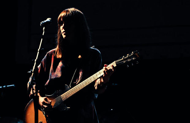
I like this particular image as the lighting is limited yet you can still clearly see the musician on stage. The use of lighting makes the female look very timid and fragile with a sense of mystery as the lighting only allows you to see half of her face.
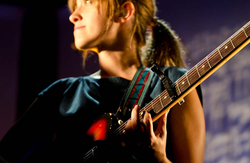
I think this image is effective because the main focus is on her hand position on her music instrument. The rest of her is caught in a blur which shows creativity and depth within the image. This makes me like the image more as it doesn’t look clean cut and fully in focus.
This image is fully based around the expression that the musician has. As it is a close up image, this is clearer to identify. Again, his hand is not in focus whereas his face is sharp in this use of depth of field.
Piper Ferguson is a music photographer based in Los Angeles. Piper says her inspiration to be a photographer, director, and screenwriter comes from ‘80s fashion and the hyper-reality of MTV. Her images are edgy and soulful, and she’s both toured with Iron & Wine and photographed artists at Coachella, South By Southwest, and the Winter Music Conference. Her images enable the audience to see a story within the shots that she takes so carefully.
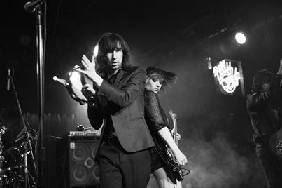
I like this image due to the fact that it looks like a very good action shot. The woman’s hair in the background is sweeping round and is caught at a very good moment. The setting also has a very successful feel to it as it makes it seem more rocky and energetic.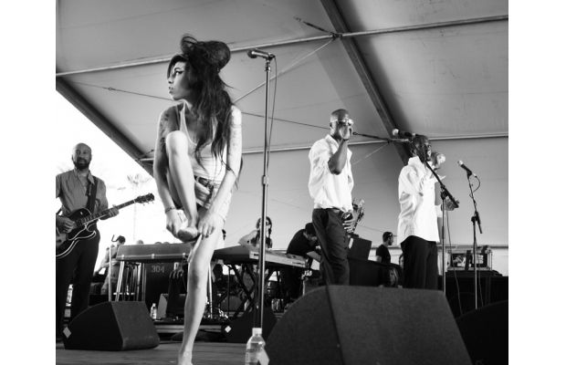
This image is a very natural shot as Amy Winehouse is standing in a not so comfortable position and looking very emotionally comfortable in her surroundings yet is enclosed in other musicians currently playing around her.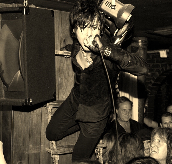
I like the rebellious feel to this image, the colouring used is very complimenting as well, as it is not the typical black and white or pure colour effect. The expression on his face is clear to see and automatically sets the mood of the image.
Annabel Staff is a London based music photographer who uses colour so distinctively in her images, that it seems like all of the shows she shoots in London are perfectly lit and posed. Obviously, none of these musicians are posing; she’s just captured them at the right moment.

This image is very vibrant yet the use of colours compliment each other well. The focus in this image is mainly around the variety of colours as the more neutral colours such as the microphone in the foreground is blurred slightly.
Although Annabel Staff is known for her careful use of lighting in her work, this image is equally effect even though she has used just simplistic natural light. The overpowering bright background is just as bold as any artificial light that is used in her concert photography. I think this image is very brave because the main source of light in this image is coming from one beam of artificial light in the background. This image works very well as it highlights everything in the image clearly.
Miami based Khadija Bhuiyan regularly shoots at popular Miami venue, Grand Central, in addition to festivals like ULTRA and Winter Music Conference, capturing musicians at the peak of their performances and crowds at the height of their excitement; This enables her to create fascinating and energetic shots.
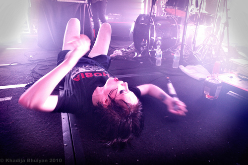
These images are very good at showing the energy used in concerts form both musicians and the fans. The use of light used in this image is very effective as it appears overwhelming to the musician exhausted on the floor.
The use of lighting in this image is very strong and therefore makes everything within the image appear green or golden. Again, the facial expression is very clean cut and in focus in this image.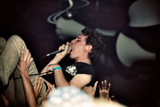
This image is very tightly cropped however, I like this part of the image, it makes it feel like the audience is part of the crowd as you can only see arms and the musician and therefore feel as if you are in the thick of it.
One of the most well known music photographer is known as Rukes. People started to notice him from photos he took as official concert photographer for Deadmau5, but since then he’s photographed Avicii, Skrillex, Kaskade, Swedish House Mafia, Afrojack, and more at historic concerts, raves, and festivals. Rukes is so successful that he has managed to travel a lot during his career creating many more well known, professional photographs.

I like the range of colours used in this due to explosives and artificial light. It presents excitement and has a very vibrant feel to the image.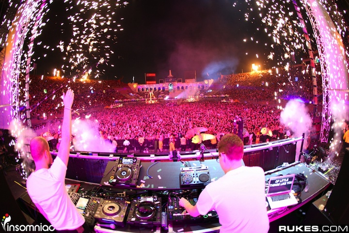
The colouring in this image is very strong, making it look as if everything in the image is pink, this is very effective as I know that that was not the case. The filled area makes the image appear very energetic. This is my favourite picture from Rukes. The strobe lighting in this image is fascinating yet the crowd is still in focus. The different colours entwining with each other looks very professional and complex.
Abstract Photography:
‘Abstract photography’ presents the viewer to part of an object. The aim is to help the viewer gain an emotional, almost primeval link to the image. For the viewer, abstract photography is not about knowing and recognising the subject. Even so abstracts are sometimes recognisable as real world objects or scenes. Like abstract art, Abstract photography concentrates on shape, form, colour, pattern and texture. Focus can add to the conceptual feel of abstracts by isolating parts of the subject through the use of blur. Good quality blur, bokeh, is the frosted-focus effect created by control of the Depth of field; the other dimension is movement blur.
Research taken from: http://www.photokonnexion.com/?page_id=2406
Some examples of abstract photography
 Alice Marie
 Robert
 Hilde Van Hove
 Mike Melnotte
 Dogan Kokdemir
 Alessandro Carboni
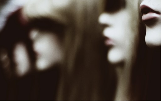
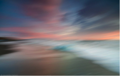
Although all of the above images are different, the one thing they have in common is that they are all very simplistic and this is what I love most about them. As an audience, we tend to think too far into things whereas Abstract photography allows us to do this automatically whilst using simplistic shapes, colours and objects. I have had inspiration from each of these images individually in different ways and would love to recreate some. The main way that these images represent abstract photography is through either blurring part or all of the image and also by using very close-up, cropped images of objects.
Wildlife Photography:
Wildlife photography is based around taking images of wild animals. This is a very brave and difficult photography genre as some animals are difficult to approach and the photography must have a good knowledge of the individual animal’s behaviour in order to be able to predict its actions. While wildlife photographs can be taken using basic equipment, successful photography of some types of wildlife requires specialist equipment, such as macro lenses for insects, long focal length lenses for birds and underwater cameras for marine life. However, a great wildlife photograph can also be the result of being in the right place at the right time.
Info from: http://en.wikipedia.org/wiki/Wildlife_photography
David Lloyd is a wildlife photographer from New Zealand living in London. Some of his favourite places to shoot are Kenya, Rwanda, Uganda, Botswana, and Richmond Park. David Lloyd prefers a fine art style, and he has a preference towards black and white, colour features strongly too. He has acquired each portfolio of the Wildlife Photographer of the Year series since its inception in 1991. They have been, and they continue to be, his biggest inspiration.
http://davidlloyd.net/about/
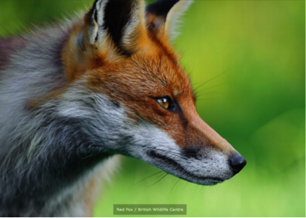


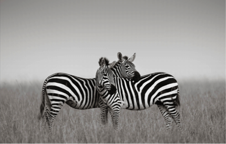
After looking at some of David Lloyd‘s wildlife photography work online, I instantly took a liking to his shots. The above images are my particular favourites, especially of the lion and leopards, as I personally love big cats in general. Each shot from above are taking with great patience. The image of the fox is a nice intense image which is very sharp, mainly focusing on its eyes. I particularly like the image of the lion cub on its own as the natural lighting really compliments the image as a whole. The background has a nice blurred effect whilst the cub and the grass it is sitting on remains in focus representing the small cub in a big surrounding. The shot of the two leopards play fighting requires a different type of patience. Instead of keeping still waiting for the right angle of the wildlife as seen in the previous two images, this shot was taking at just the right time to highlight the playful elements between the two animals. The final black and white image of the two zebras is very simplistic yet effective. The two zebras are positioned in the centre of the image with their bodies crossing each other, recreating a type of hugging embrace between the two animals. The black and white effect softens the image slightly also.
Andy Rouse is one of the best-known British wildlife photographers, with 17 books to his name and regular contributions of photographs and photographic advice to newspapers and magazines, including a monthly column for Practical Photography. For seven years in a row he has been commended and won prizes in the Wildlife Photographer of the Year competition – including the Gerald Durrell Award for Endangered Species. He is the current holder of the Royal Geographical Society Cherry Kearton award. His photographic style has changed over the years, and he is now an expert on time-lapse photography and is currently exploring the world of artistic monochrome. Andy shoots with a Canon system and has always been a MAC user.
http://www.wildphotos.org.uk/speakers/andy-rouse#sthash.KIvzs1KW.dpuf
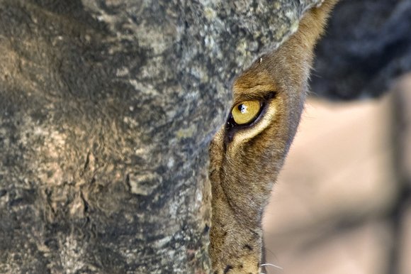

By looking at some of Andy Rouse’s work online, it is clear that most of his work consists of action shots from wildlife. The first image I chose of Andy Rouse’s works clearly displays how dangerous the genre can be through the close up shot of the lion’s expression which is very striking even though there is not a lot else going on in the image.
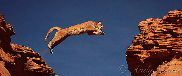
The second image is an example of his action shots. This image is beautiful because it shows the strength and power of the animal yet shows it a vulnerable stage as it is in mid-air. The length of the animal is the main focus of this shot as it leaps from one bit of land to the other.
The final image is my favourite by Andy Rouse. The natural lighting from the sunset/sunrise makes detail harder to see in the lion, however, as the lion’s breath is a lot thinner, the light shines straight through it, highlighting it and giving it a focal point. It shows that even the most strongest, powerful animals in the wild also have a tough time surviving.